Metcalfe’s Law states that the more users that a network has, the more valuable it is to those users. It’s a powerful idea that is exploited by companies like LinkedIn, Airbnb, or Uber — all companies that provide a more beneficial service as their networks gain more nodes. But network effects don’t apply just to technology and related fields. In the financial sector, for example, stock exchanges grow in utility when they have more buyers, sellers, and volume. Likewise, in international finance, a currency can become increasingly entrenched when it’s accepted, used, and trusted all over the world.
What’s a Reserve Currency?
Today’s visualization comes to us from HowMuch.net, and it breaks down foreign reserves held by countries — but what is a reserve currency, anyways? In essence, reserve currencies (i.e. U.S. dollar, pound sterling, euro, etc.) are held on to by central banks for the following major reasons:
To maintain a stable exchange rate for the domestic currency To ensure liquidity in the case of an economic or political crisis To provide confidence to international buyers and foreign investors To fulfill international obligations, such as paying down debt To diversify central bank portfolios, reducing overall risk
Not surprisingly, central banks benefit the most from stockpiling widely-held reserve currencies such as the U.S. dollar or the euro. Because these currencies are accepted almost everywhere, they provide third-parties with extra confidence and perceived liquidity. This is a network effect that snowballs from the growing use of a particular reserve currency over others.
Reserve Currencies Over Time
Here is how the usage of reserve currencies has evolved over the last 15 years: Over this timeframe, there have been small ups and downs in most reserve currencies. Today, the U.S. dollar is the world’s most powerful reserve currency, making up over 61% of foreign reserves. The dollar gets an extensive network effect from its use abroad, and this translates into several advantages for the multi-trillion dollar U.S. economy. The euro, yen, and pound sterling are the other mainstay reserve currencies, adding up to roughly 30% of foreign reserves. Finally, the most peculiar data series above is “Other”, which grew from 2.0% to 8.4% of worldwide foreign reserves over the last 15 years. This bucket includes the Canadian dollar, the Australian dollar, the Swiss franc, and the Chinese renminbi.
Accepted Everywhere?
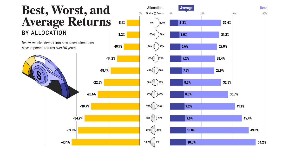
There have been rumblings in the media for decades now about the rise of the Chinese renminbi as a potential new challenger on the reserve currency front. While there are still big structural problems that will prevent this from happening as fast as some may expect, the currency is still on the rise internationally. What will the composition of global foreign reserves look like in another 15 years? on Last year, stock and bond returns tumbled after the Federal Reserve hiked interest rates at the fastest speed in 40 years. It was the first time in decades that both asset classes posted negative annual investment returns in tandem. Over four decades, this has happened 2.4% of the time across any 12-month rolling period. To look at how various stock and bond asset allocations have performed over history—and their broader correlations—the above graphic charts their best, worst, and average returns, using data from Vanguard.
How Has Asset Allocation Impacted Returns?
Based on data between 1926 and 2019, the table below looks at the spectrum of market returns of different asset allocations:
We can see that a portfolio made entirely of stocks returned 10.3% on average, the highest across all asset allocations. Of course, this came with wider return variance, hitting an annual low of -43% and a high of 54%.
A traditional 60/40 portfolio—which has lost its luster in recent years as low interest rates have led to lower bond returns—saw an average historical return of 8.8%. As interest rates have climbed in recent years, this may widen its appeal once again as bond returns may rise.
Meanwhile, a 100% bond portfolio averaged 5.3% in annual returns over the period. Bonds typically serve as a hedge against portfolio losses thanks to their typically negative historical correlation to stocks.
A Closer Look at Historical Correlations
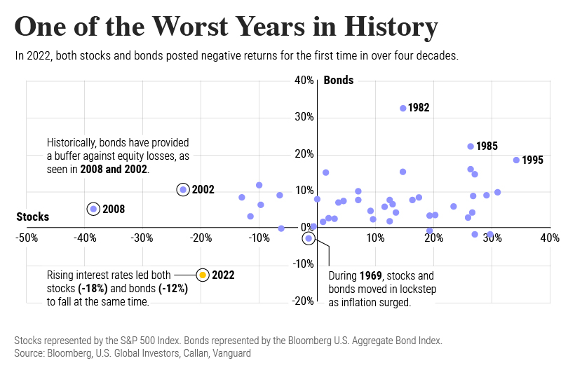
To understand how 2022 was an outlier in terms of asset correlations we can look at the graphic below:
The last time stocks and bonds moved together in a negative direction was in 1969. At the time, inflation was accelerating and the Fed was hiking interest rates to cool rising costs. In fact, historically, when inflation surges, stocks and bonds have often moved in similar directions. Underscoring this divergence is real interest rate volatility. When real interest rates are a driving force in the market, as we have seen in the last year, it hurts both stock and bond returns. This is because higher interest rates can reduce the future cash flows of these investments. Adding another layer is the level of risk appetite among investors. When the economic outlook is uncertain and interest rate volatility is high, investors are more likely to take risk off their portfolios and demand higher returns for taking on higher risk. This can push down equity and bond prices. On the other hand, if the economic outlook is positive, investors may be willing to take on more risk, in turn potentially boosting equity prices.
Current Investment Returns in Context
Today, financial markets are seeing sharp swings as the ripple effects of higher interest rates are sinking in. For investors, historical data provides insight on long-term asset allocation trends. Over the last century, cycles of high interest rates have come and gone. Both equity and bond investment returns have been resilient for investors who stay the course.
